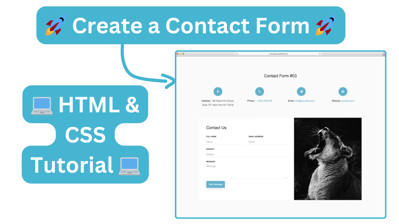
Want to see this Responsive Contact Us Form come to life? Check out the accompanying video tutorial below for a step-by-step guide on building this Responsive Contact Us Form using HTML, CSS. The video will walk you through the code at your own pace, making it easy to learn and follow along. Bonus Tip:While you're watching, consider subscribing to my YouTube channel for more coding tutorials and web development tips! I regularly upload new content to help you on your coding journey. Here's what you'll learn in the video: The HTML structure for building the Create Responsive Contact Us Form. How to style the Responsive Contact Us Form with CSS for a clean and professional look. Tips and tricks for customizing your Responsive Contact Us Form Page.
Ready to Get Coding? This code is your playground! We've provided the building blocks to create this Create Responsive Contact Us Form, but the fun part is making it your own. Click the button and get hands-on with the code. Here are some ideas to spark your creativity: html css edit & experiment 🚀 Create a Contact Form | 💻 address: 198 West 21th Street, Suite 721 New York NY 10016 phone: + 1235 2355 98 email: info@yoursite.com website: yoursite.com contact us full name email address subject message <textarea name="w3review" rows="4" cols="30"></textarea> @import url("https://fonts.googleapis.com/css2?family=Poppins:wght@200;300;400;500;600;700&display=swap"); * { margin: 0; padding: 0; box-sizing: border-box; font-family: "Poppins", sans-serif; } :root { --primary-color: #46b5d1; } body { background-color: #f8f9fa; } .wrapper { padding: 7rem 0rem; width: 73%; margin: auto; } .row-1 ul { display: flex; list-style: none; } ul li { width: 25%; display: flex; flex-direction: column; align-items: center; } ul li .icons { width: 60px; height: 60px; border-radius: 50%; background: var(--primary-color); margin-bottom: 20px; } ul li .icons { display: flex; align-items: center; justify-content: center; } ul li p { font-size: 16px; font-weight: 400; margin-bottom: 0; } ul li p span:first-child { text-transform: capitalize; } ul li p span:last-child { padding-left: 5px; } ul li + li p span:last-child { color: var(--primary-color); } ul li:first-child p span:last-child { color: #666666; } .row-2 { display: flex; margin-top: 4.5rem; } .row-2 .col-1 { width: 100%; padding: 3rem; } .row-2 .col-1 h1 { text-transform: capitalize; font-size: 1.75rem; line-height: 1.75rem; font-weight: 400; margin-bottom: 1.5rem; color: black; } form .input-field-row-1 { display: flex; gap: 1.8rem; } form .input-field-row-1 .input-field { width: 100%; } form .input-field { display: flex; flex-direction: column; margin-bottom: 1rem; } form .input-field label { color: black; font-size: 12px; font-weight: 600; margin-bottom: 0.5rem; text-transform: uppercase; } form .input-field input, form .input-field textarea { width: 100%; line-height: 1.5rem; outline: none; border: none; border-bottom: 1px solid rgba(0, 0, 0, 0.1); border-radius: 2px; font-size: 16px; color: #666666; transition: all 0.2s linear; } form .input-field input { height: 36px; } form .input-field textarea { resize: none; } form .input-field input:focus, form .input-field textarea:focus { background-color: white; border-color: var(--primary-color); } form .input-field input::placeholder { color: rgba(0, 0, 0, 0.3); } form input[type="submit"] { outline: none; border: none; border-width: 1px; border-radius: 5px; font-size: 14px; font-weight: 400; padding: 12px 16px; text-transform: capitalize; background-color: var(--primary-color); box-shadow: 0px 10px 20px -6px rgba(0, 0, 0, 0.12); margin-bottom: 20px; color: #f8f9fa; } form input[type="submit"]:hover, form input[type="submit"]:focus { border-color: #2d9bb7 !important; background: #2d9bb7 !important; } .row-2 .col-2 figure { width: 28.9rem; height: 35.2rem; } .col-2 figure img { width: 100%; height: 100%; object-fit: cover; } @media (max-width: 1280px) { .wrapper { width: 90%; } } @media (max-width: 1024px) { .row-2 .col-2 figure { width: 23.9rem; height: 29.2rem; } } @media (max-width: 768px) { .row-1 ul { flex-wrap: wrap; } ul li { width: 50%; } .row-2 { flex-direction: column; } .row-2 .col-2 { display: none; } } **Don't be afraid to experiment! ** The beauty of coding is that there's usually more than one way to achieve something. Feel free to break things and try again. That's the best way to learn and become a confident coder.